
by Russell Sands
As a supplement to the long term trend following approach of the Turtles, I also look at many shorter term indicators. Of everything I’ve examined in the past (and I’ve sifted through a lot of stuff), I personally think that Market Profile is one of the best tools ever developed to help explain market behavior and price movements. I will try to teach some of the ways you can use the Profile to help your trading as well. But, before getting started, let it be said that Market Profile is not a ‘system’ only a tool. It is only as good as the interpretation of the user (that’s you). And like Turtle Trading, you first have to know what you are looking for, and then figure out what it means.
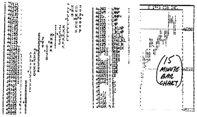
The Market Profile is basically a bell shaped price distribution curve, with prices on the vertical axis, and volume, as a substitute for time, on the horizontal axis. The graph is broke up into half hour time periods, each represented by a sequential letter of the alphabet, according to the way floor traders keep their trading cards in the pit. In this example of the S&P, the letter ‘B’ shows all prices that were traded between 9:30am EST and 10:00am, while ‘C’ shows the range between 10:00am to 10:30am, etc. When you put it all together, you can se a picture of where prices have been during the day. The first thing that should be obvious to even the inexperienced eye is that the market basically went up all day long. This is evident by each successive half hour range being higher than the previous one. The hard part is knowing what to do with this information. Be patient… it’s coming.
The most basic tenet of Profiles is that where most of the trading takes place is considered to be the fair value area for the market. This acceptance of fair prices is characterized by the ‘fat’ part of the bell shaped curve, statistically known as the first standard deviation. It is where approximately two thirds of the volume area under the curve lies, in this case where two thirds of the trading takes place for the day.
In our example, this area is approximately between 46050 and 46250. In a normal bell shaped curve, the fat part is in the middle of the curve, then it spreads out and gets thinner at both ends. But, there is nothing in physics or statistics that says it has to be that way. So what does this mean? One interpretation is that prices have gone up too far (price has gotten above value) and will rotate back down towards the middle of the range. But, in this example, the fact that the 1st S.D. (the fat part) is at the upper end of the daily range, combined with the fact that the market went up all day long (and closed strong as well) would lead us to believe that value is going to lead prices even higher tomorrow, so look for continuation. The implications are that I could either go long this market for a short term trade, or feel comfortable adding to an existing position if this were a long term uptrend, because I expect prices to continue up for at least one more day. There is so much to work with, and this barely scratches the surface.
Developed by a Chicago floor trader named Peter Steidlmayer in the early 1980’s, the Profile is based on the concept of a classically distributed bell shaped curve. Price is graphed along the vertical axis, and volume, as a substitute for time, is graphed along the horizontal axis. The overall shape of the curve, its location with respect to the two axes, and the location of opening and closing prices within each curve, combine to give clues as to current market condition and future market direction.
While normal bell shaped curves look like figure 1 (below), with the greatest area of value in the middle, there is nothing that says they can’t also look like figure 2, with the value area skewed to one end rather than in the middle. Figures 1A and 2A, of Orange Juice and Soybeans respectively, show that an intraday distribution of prices can resemble either type of curve. Prices are broken up into half hour ranges, with each letter of the alphabet representing a successive time period throughout the day. Floor traders keep their trading cards this way, and must turn them in to their clearing firms every half hour. Because Pete was a floor trader, he undoubtedly decided to organize his price data in this fashion.
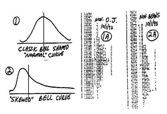
The shape of the curve is the first clue to future direction. Notice that Juice is the normal curve, with prices evenly distributed around the middle of the day’s range. In fact, during the last half hour of the day (J period) the market made both new highs and new lows, with price visiting the entire range. The market is comfortable in its current range, and unsure of future direction. Although a future price move is imminent (nothing stays in the same place forever), I would expect this market to open quietly unchanged the next day. On the other hand, the Profile of Soybeans shows a market that opened near the high of the day, and proceeded to go straight down. Unlike the ‘normally’ shaped Juice curve, Beans are clearly skewed towards the downside. This shape, combined with a close near the low of the day, implies that prices will continue lower, at least in the immediate future.
Finally, note that on both profiles, there is what appears to be a heavy doted line immediately to the right of what can be called the ‘fat’ part of the curve. This line defines the boundaries of the first standard deviation, the area where two thirds of the days volume has taken place. When we talk about prices moving higher or lower (or remaining unchanged) in the immediate future, we are talking about a price level with respect to this ‘value area’, as opposed to where the market actually closed. Assuming both markets open unchanged from the close (Juice at 13050 and Beans at 618), we would expect the Juice to gravitate back up towards the middle of the range at 13120, while we would expect the Beans to continue down below 618.
There are many ways to study Profiles, but what is first required is an understanding of some of the basics. Different parts of he Profile are used to describe certain internal market behaviors. The three basic components of a daily Profile are called Extremes, Range Extensions, and TPO (Time Price Opportunity) Counts. Each one of these characteristics, and the various combinations thereof, mean certain things when you know how to interpret them. For longer term analysis, it is also important whether today’s Profile occurs above or below the previous day’s range. This location will define the two types of market activity know as either ‘initiating’ or ‘responsive’ buying and/or selling, and is important in helping to determine whether a market is set up for trend continuation or possible reversal.
The study of Market Profiles is known by the generic term ‘Market Logic’. Market Logic, like other subset forms of technical analysis such as Candlesticks or Elliott Waves, have both their supporters and detractors. It is important to realize that this is only a ‘tool’, not a ‘system’, and therefore, only valuable to those who know how to employ the tool properly. But the thing that makes Market Logic different is that the analysis is what is scientifically known as “Systematic” analysis. This means that the information is internal as opposed to external.
As prices unfold during the day, the market is telling you in the current time frames exactly what is going on (and perhaps what to expect in the future). All other technical analysis is based on past information. Breakouts, moving averages, waves, etc. all help define where the market has been in the past, they are all in a sense ‘lagging’ indicators. But the Profile, when employed properly, can be either a ‘current’ or perhaps even a ‘leading’ indicator.


Recent Comments