
by Stephen Bigalow
Candlestick analysis is a simple approach to finding stocks that have the potential of making a strong move up or down in price. The advantage of Candlestick charts is that the trend is easily identifiable. Begin by making yourself aware of where the overall market is. Either at the start of each trading day, the end of each trading day, or both, be sure to take a look at the major stock indexes. Different data services will use different symbols for these indexes, but when it comes to stocks that are traded in the U.S. these three indexes are the most important:
- Dow Jones Industrial Average
- S&P 500 Index
- Nasdaq 100 Index
For the Nasdaq 100 Index, we prefer to use the QQQ. Always display daily charts of these indexes in a Candlestick format. Colors for Candlestick charts will vary from black and white to red and green (or perhaps even other colors), but the most popular is black and white.
Candlestick charts differ from regular price charts in such a way that each price bar gives a visual representation as to whether the trading activity was positive for that day or negative. On a day when price finishes higher than the first trade of the day, the candle body is white (or empty) and when the price finishes lower, the candle body is black (or solid). If red and green candles are displayed, green is a candle that finishes higher than the open and red is a candle that finishes lower.
Although Candlestick charts can be applied to any time frame, daily charts are the most convenient and effective. The use of daily charts allows for trading decisions to be made once a day.

Whether your daily chart is one of the three major indexes or an individual stock, the process is the same. Start by trying to identify the ‘tradable trends’.
As a general rule, a tradable trend is a period of at least 10 days when most of the candles are the same color. Strong tradable trends can last 10 weeks or longer.
If most of the candles are white (or empty), the trend should be up and if most are black (or solid), the trend should be down.
By looking at daily charts of the three major averages each day, you can make yourself aware of the recent ‘overall’ trend in the market. But, keep in mind that these trends don’t last forever. The value of Candlestick analysis is the ability to make trading decisions that carry reasonably ‘low risk’.
Candlestick charts have been around for many years and most traders have used them. But Candlestick charts are only the first step in Candlestick Analysis. The ability to identify a Candlestick pattern when an index or individual stock is in an ‘overbought or oversold’ condition is the key to Candlestick success.
If you are new to Candlestick analysis or if you’ve been unsuccessful on previous attempts, start by waiting for the overall stock market to go through a pull back. If charts of the three major averages are moving higher, you may find it frustrating to try to pick up the top. Trying to identify a bottom is often easier than trying to identify a top.
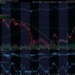
When doing your analysis, keep this in mind; don’t be too anxious to form an opinion that a stock will go down. Companies pay serious money to the CEO, other management personnel, and to their sales people. If you do a trade and the only possibility for success is for the price of the stock to go down, remember that you’ve got a lot of very skilled people betting against you. There are certainly times when stocks will move lower (the year 2008 is an example), and there are times when stocks in a particular industry group will trend lower (energy stocks in 2014), but you shouldn’t start out by trying to make those choices. Be patient, wait for the ‘overall’ market to trend lower. In the chart below, we’ve identified three areas that should be viewed as ‘potentially’ tradable bottoms. In each instance, the price was lower than the previous 8 bars. Most of these 8 bars are black (or solid) which would identify these areas as short-term down trends. Keep in mind that short-term down trends have the potential of becoming tradable bottoms. Candlestick analysis makes it possible for a ‘potentially’ tradable bottom to become an actual trade.

An important part of Candlestick analysis is the ability to identify when an index or a stock is an ‘overbought or oversold’ condition. The simplest way to do this is to add an indicator to the chart that’s designed to identify these overbought and oversold conditions.
Charts from most data services give the user the ability to add various indicators to charts. Although there are many that will work fine, we prefer the Stochastic Indicator. There are two popular versions of this indicator, but we prefer the version referred to as the ‘Slow’ Stochastic. In addition to choosing 12 as the number of periods, the indicator can be displayed as one line or as two lines.

For a two line Stochastic, the parameters are 12-3-3 and for a single line, they’re 12-3-1. If your data service does not give you the ability to display the Stochastic as one line, don’t worry about it. The importance of this indicator is that when the Stochastic line (or lines) is above 80 (the upper horizontal dashed line), it indicates an oversold condition.
Shown in the charts above, as the price went lower and lower an oversold condition existed at points ‘A’, ‘B’ and ‘C’. During an oversold condition, Candlestick patterns are a tremendous help in identifying a ‘low risk’ time to enter the market.
In every market, bottoms and tops are basically a ‘tug of war’ between buyers and sellers. When a stock declines, it begins with an overabundance of sellers. Then, as the price moves lower, more and more traders and investors will make the decision to close their positions and move on to another stock. But sooner or later, the number of ‘willing’ sellers begins to dry up. Often this occurs with one final day of ‘anxious’ selling. A tradable bottom develops when most of the ‘willing’ sellers have closed their positions.
The beauty of Candlestick analysis is that it allows us to identify ‘the end of the selling’ and the beginning of some ‘mild buying’. The mild buying represents cautious buyers coming into the market. If the beginning of the buying occurs on the same day as the end of the selling, it represents ‘indecision’ on the part of traders.


Recent Comments