Happy Financial Freedom Friday!
This is advice I regularly share with family. The wisest thing you can do every moment of the day is to be on own side. Be your own best friend. Know you are an awesome human being, and follow your own positive guidance, which then creates spectacular results.
These thoughts apply to everyone. Try it! Repeat them daily.
Here’s What Is Covered Below:
- Different time frame charts.
- What are they telling you?
- Which one is best?
- Which one is right for you?
Today, we are going to discuss various time frame charts with the hope you will decide which one is right for you.
In general terms, charts paint a picture of what is happening with price. This picture can change or be interpreted differently depending on the time frame that forms the candles.
On past Fridays, we have discussed different time frame charts and indicators. It is important for each trader to determine which time frame chart suits them for their lifestyle and what is taking place at that time in their life. It wouldn’t make sense for a trader to be watching a 3 or 5-minute chart used for day-trading if they only planned to look at the chart once or twice a day. Nor would it be wise to have a person interested in being an active trade, to sit in front of a computer all day staring at a weekly chart, where it takes 5 days to fully form one candle.
So, the first question to ask yourself is how much time do you want to devote to trading? Are you going to approach trading as if it is a daily job where you are active throughout the day? Or is this something you want to check in the morning, maybe again at lunch and then, late afternoon? Or are you looking for something to do and check for a few minutes in the evening? Your answer will help you settle into the right time frame chart.


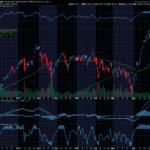
As we have discussed in past articles, the candlesticks on a chart like those on the one above reflects price movement over a specific period of time. On this chart, which shows the price activity for the Nasdaq, each bar (red or green) shows the price movement over a 10-minute period. For each hour there are 6 candles.
A chart such as this would do no good if you were interested in looking at a chart once or twice a day, because it doesn’t show what took place yesterday, earlier in the week or last month.
The next chart shares information where each candle shows price moves over 30-minutes.

This 30-minute chart shows price activity over 3 ½ weeks. If you want to look at the chart just a couple times a day to check what is happening, this might be a good chart for you. You can see, in a general sense, the trends suggests price is going up or down. Of course, when you are actually trading, you will be using other indicators, but today’s discussion is to help you zero in on the right time frame chart.
On this chart, each hour and the first 30-minutes in the 6 ½ hour trading day and are represented by 13 candles each day. One candle for each 30-minute period.
If your desire is spending less time each day at the computer, where you, perhaps, just check the chart for a few minutes in the evening, then a daily chart might suit your purposes.


On the chart above, each candle represents a day. As you will note, the chart covers a year of price activity and shares the overall market trend which has been up and down for the last couple months with short swings.
Many traders use daily charts or they day-trade. The next chart is interesting for overall reference and some traders trade it where they get in and hold trades for months. It is a weekly chart, where each candle represents price movement over a week’s period.

Note now the general trend was up from March 2020 to December 2021, then it pulled back and is now in a second attempt to recover. Overall, the market pulled back to what might be considered about halfway on the period covered on this chart or 4 + years.
This chart helps to bring in perspective whether you want to zero in on the price movement hour-to-hour, day-to-day or week-to-week. What is right for you? How much time do you want to devote to trading.
I hope you find this information useful.
Friday is education day. My goal is to teach everyday people (like me) to successfully trade options. I do my best to write in an understandable way as if we are talking while sitting on the deck of my house in a relaxed atmosphere.
The trading tools you select, and use are important, and can make your trading easier and more effective.
Have a great weekend.
Remind yourself that your life is rich with opportunities. Every day is a new start. Decide what you want to play out and move in that direction. Take a step and then another… you will succeed! WTG!
Wendy


Recent Comments