
by Ray Frazier
Moving Average and the Price Chart
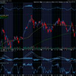
The following chart has four indicators on it. The chart has three sections, with the top section being the price chart and the bottom two sections indicators. You will notice that there are two lines in the top section. The lighter line is a 21 day exponential moving average and the darker line is the 50 day exponential moving average.
The 21 day moving average simply measures the average price action over a period of 21 trading days and the 50 day moving average measures the average price action over a period of 50 trading days. The word exponential means weighted when used in reference to moving averages. Typically, an investor has two choices when choosing the type of moving averages.
The first is a simple moving average which is greatly delayed in response to stock movements. With an exponential moving average the data is weighted to respond to the most recent price fluctuations of a stock. I favor using an exponential moving average over a simple moving average because they respond much quicker to stock turnarounds. For a faster entry point, you may want to consider a 10 day exponential moving average crossover, but only if the other indicators (such as stochastics and or MACD) are all indicating the same thing. I especially like to buy stocks or options when the stock has traded two days above the 10 day moving average, stochastics is below the 80 line and MACD is turning up above the zero line.

Moving Average Convergence Divergence (MACD)
The second section contains what appears to be three different indicators. In reality, they are not three indicators but one. This indicator is called Moving Average Convergence Divergence (MACD). This indicator is an oscillator that measures the gap between the longer moving average and the shorter moving average. This indicator has an equilibrium line, which is considered to be zero, and two moving averages. The darker curving line is a longer moving average. The bars in the background are called a histogram, which graphically shows the gap between the two curving lines (two moving averages).
The use of MACD is to indicate whether a stock is going up and when a stock is turning around and going down. When the two moving averages are below the equilibrium line (zero), it means that the shorter moving average is less than the longer moving average. This is a bearish signal for the stock, and it could possibly go down in price for some time. When the two moving averages are above the equilibrium line, this means that the stock is in a bullish mode. You should note that the equilibrium line is extremely important. When the two moving averages cross the equilibrium line, it means that sentiment for stock investors is either bullish or bearish. When the two moving averages cross upward through the equilibrium line, investors tend to buy the stock and take it higher. This is a bullish signal. When the two moving averages cross downward through the equilibrium line, investors tend to sell the stock heavily. This is a bearish signal.

The two moving averages can help you time your stock/options entry and exit. When looking at a chart, you will see that when the darker line (short moving average) crosses the lighter line (longer moving average) to the upside, the stock price moves to the upside, and when the short moving average (darker line) crosses the longer moving average (lighter line) to the downside, the stock price moves downward.
For short-term trading this indicator is extremely important. As you can see, the histogram spikes up when the price of the stock makes a large gain in one day, and it spikes down if the stock price makes a large decline in one day. As you look at the histogram, you will notice that some of the bars are much longer than others. When the bars are on top of the equilibrium line, the bars get larger as momentum picks up and the stock moves higher on stronger volume. When the bars are below the equilibrium line, the bars get longer when selling of the stock accelerates. When buying or selling starts to go in the opposite direction, the histogram bars will start to get shorter. This indicates that it is time to get into or out of the stock. As I’ve said before, the histogram bars measure the distance between the longer moving average and the shorter moving average and are a good indication of momentum.
Time Segmented Volume
In the bottom section of the chart you see a jagged line and a smooth line. The jagged line is time segmented volume (TSV) and the smooth line is a moving average. Time Segmented Volume plotted on a moving average is extremely helpful in determining demand for the stock and is a measure of negative volume versus positive volume. In other words, volume for the stock on up days versus volume for the stock on down days. The moving average is used to judge when volume will become negative or positive for the stock.
When talking about confirmation of a trade, you should not buy a stock or an option based on one indicator. Usually I like to wait for the stock to cross the 21 day exponential moving average before I will consider buying the stock or an option on the stock. The same goes for shorting stock or buying a put option on the stock. Sometimes stocks will have a fake breakout to the upside or downside. Therefore, you should always look for some sort of confirmation on the stock move with at least one other indicator. This will help to avoid buying a fake breakout.


Recent Comments