by Adam Oliensis
More extensive discussions of technical price patterns, support and resistance, and trending vs. trading markets are available elsewhere. But this discussion should serve as a reasonable introduction to the subject, and guide you toward the most important tools.
Is the market in an uptrend, a downtrend, or trading in a range?
An uptrend is defined as a market that is making a series of higher highs and higher lows. Here is a very clear example of an uptrending market.

As you can see, the market is making higher highs and higher lows within a well defined channel (black oblique lines).
A downtrend is defined as a market that is making a series of lower highs and lower lows. Here is a clear downtrend.

As you can see, a series of lower lows and lower highs is forming within a fairly well defined channel.
Uptrending markets tend to break resistance (prior price peaks). Downtrending markets tend to break support (prior price troughs).
A trading-range (or flat) market is one that is not in either an uptrend or a downtrend. Here is an example of a market that is trading in a range:

During this 22-month period, the Dow Jones Industrial Average traded mainly between about 10,000 and 11,300, with a few brief forays outside that range just to test the market’s reaction to price action outside those limits. And, as you can see, those brief forays outside the trading range were quickly rejected, each time prompting an aggressive move to the opposite side of the trading range for a “gut check.”
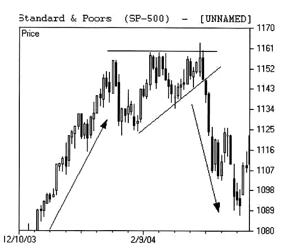
Trading ranges comes in a variety of forms: a trading range can be a “box,” which is an essentially rectangular pattern, like the Dow chart above. Or it can be in a “pinch” or compressing pattern that is essentially triangular in shape, like the one seen in the mid 1100s on the SPX in the next chart.

Here the market trends higher (up arrow) into late January, then consolidates into early March in a triangular shape (you could argue that the upper limit of the triangle should be tilted upward, in which case this would be a “bearish rising wedge”), and then the market breaks down in mid-March, suffering a pronounced short-term downtrend.
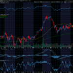
Of course, how one defines trends and trading ranges depends on a number of factors, one of the most important of which is time frame. Which is to say that one man’s trend may be another man’s trading range. For instance, this monthly candlestick chart (each candlestick represents one month’s trading in the S&P 500) including the December ’03 – March ’04 period represented on the chart above.

On this monthly chart the entire downtrend that’s on the right-hand side of the December ’03 – March ’04 daily chart above is ensconced within the grey-highlighted hammer candle.
To a trader with a long-term time frame the highlighted hammer candle is a preliminary warning sign of a possible trend reversal, where to a short-term trader the drop from the mid 1110s down toward 1089 was a full-on breakdown from a topping formation, followed by a very tradable downtrend.
Precisely how one defines trends vs. trading ranges is somewhat variable from trader to trader. There are many sorts of technical price patterns and formations with various colorful names (pennants, flags, ascending triangles, descending triangles, symmetrical triangles, head & shoulder tops, head & shoulder bottoms, cups with handles, rising wedges, falling wedges, parabolic blow-offs, broadening tops, broadening bottoms, and so on).

What most or all of these patterns (including trending formations) have in common is that they are names by which support and resistance levels are identified.
Support is a price area at which demand for the instrument (stock, index, futures contract, etc.) is greater than the supply. So, for instance, if the S&P 500 drops down near 1089, as it did in March ’04, and at that price bids come into the market that overwhelm the asks, the S&P will bounce up from that level as demand overwhelms supply. The index will have found support at that level.
Resistance is considered to exist at a price area at which supply for the instrument is greater than the demand. So, for instance, in early ’04 the S&P 500 found resistance near 1161 (2 charts above). The index rallied near that level in January, backed off on some profit-taking, made another run at that level and then backed off a bit less, made a 3rd run at the 1161 area, and finally ran into selling in that same area. The sellers overwhelmed the buyers and the market fell out of its triangle. It found resistance (a triple top in this case), and the bulls turned tail and ran for the hills.
Often, these support and resistance levels tend to show up at price areas that have previously functioned as support and/or resistance. E.g., the Dow chart above where support was repeatedly found near 10,250 and/or 10,000, and where resistance was repeatedly found near 11,000 and/or 11,300.
The tides that turn in the markets may move swiftly or slowly. But when they do turn, they leave very clear patterns in the sand. It can often be very helpful to know whether the market is leaving “trending” or “trading range” footprints, whether support and resistance levels are holding, whether support levels are breaking, or whether resistance levels are breaking, when you are plotting your trades.


Recent Comments