Have you noticed that all the things you think about and focus on- always happen? This being the case, it is wise to dwell on what you want. Love and joy. Successful trades and abundance.
Here’s What Is Covered Below:
- How Chart Candlesticks Can Simply Your Trading And Make It Easier To Spot Wins
- How To Read Candlestick And What They Reveal
- The Most Common And Useful Candlestick Patterns
- A Great Tip To Boost Your Trading Confidence
Friday is education day. My goal is to teach everyday people (like me) to successfully trade options. I do my best to write in an understandable way as if we are talking while sitting on my deck in a relaxed atmosphere.
The trading tools you select and use are important, and can make your trading easier and more effective. I selected Chart Candlesticks as this week’s educational topic as they are a tool I rely on very often and can be a huge help to you.
Candlesticks
Chart Candlesticks are an image that shares information about price movement. Once you learn how to read Candlestick images, it instantly shares the details of price movement.
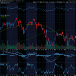
I am going to post an image of a chart and then, we will discuss the Candlesticks.


This a chart of the Dow Industrial Average (INDU is the symbol). It is a chart covering a month’s period of price movement. Each of the candlesticks represents the price movement of one day or a portion of the day if the day has not yet ended.
In a very general way, you can look at the chart and see from left to right, from the further time back on the left to the right that price has dropped (declined) on the chart above and from the 7th– 12th, it rose and then, dropped again.
The red candles are days when price dropped lower than its price when it opened. The hollow black candles are days when price rose above the open.
The candle’s information continues to be shared in the upper and lower lines called wicks.
Let’s discuss those wicks. On the red candles, an upper top of the red box is the price at open and the lower portion of the box is the current price or price at close. The box of the candle tells you the open and close price. The wicks provide additional information. The upper wick tells you the amount price rose above the opening price (its highest price or the smallest amount it dropped during the day) and the lower wick shows you the lowest before it recovered to the lowest area of the candle box.)
Okay, on to the black hollow candles. The low of the hollow box is the price where it opened and the high of the box is the price line where it is now or where it closed.
If there is an upper wick, this tells you the highest that the price rose before it closed at a lower level or where it is now before close. The lower wick if there is one tells you the lowest level price dropped below the price of when the candle opened.
There can be an upper and lower wick on all types of candles. And, we have covered the two candles that are seen most often.
Two other variations are quite rare. One is rarer than a bullish (black and white candle that is hollow), it is a solid black candle. This candle tells you the day’s price movement was bullish and up, but it closed lower than it opened. The top of the black box is the open and the lower portion of the box is where price closed. Wicks again are the highs and the lows.
The other variation is a hollow red candle. This tells you the bottom of the candle was the low open, and the top of the red box is the close which was higher but still bearish or down for the day. And, again the wicks tell the highs and lows of the day.
These four versions of the candles tell you a story about the price movement that took place- open, close and high and low.
My comments and descriptions thus far have related to candlesticks like those in the chart above where each candle tells you of the price movement over the course of a day.
There are times and types of trading, where the chart you set up is for longer or shorter periods of time. As an example, you can set up a chart where each candle gives you information covering an hour or a 30-minute period of time or a shorter period of time. The open, close, high and lows are read the same as the daily candles we discussed, but the time frame can be different on the chart. This then helps traders to tweak the chart information to fit their trading style and the amount of time they have to devote to trading.
There is lots of information to absorb, but none is harder than what we have been discussing.
Routinely remind yourself – I believe in myself and my ability to succeed. I believe in an abundance of unlimited possibilities. The future will be awesome!
I wish you the very best,
Wendy


Recent Comments