
Happy Financial Freedom Friday!
Here is a thought- Live “every” day as if it is Friday and you are looking forward to the next moments of celebrating the week’s accomplishments and that the following day will be filled with pleasure, fun and joy. Yay, say, “I can hardly wait for an awesome Saturday-like day everyday!”
Here’s What Is Covered Below:
- Candlesticks- Various price movement in different times.
- What do different candlesticks mean?
- Which candlestick is best?
- Which suits you?
Today I am going to be posting a number of images of the same equity and the same day’s price movement, but it is going to be broken up into different time frames. Once you see the various candlesticks representing the same price moves, but divided up differently, you will be able to see that the candlesticks themselves tell a story about what has taken place.
It isn’t as if one story is right, and another is wrong. They are sharing similar information but depending on your trade objectives and the time you have to devote to trading will determine which time-frame candlesticks is the right one(s) to share information with you or which tells you the best story.
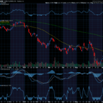
I am going to post charts relating to November 8th, 2022 for the equity JD.com, symbol (JD). JD.com is China’s largest online retailer. I didn’t select it for any particular reason. It has lots of trade volume and is a moderately priced stock. In the $45 range.
On November 8th JD moved and increased $.98 or 2.2%.
Charts reflecting a company’s price movement can be set to share price movements broken down over varying time frames. The first chart image is a daily chart. Each candle on the chart reflects to price of JD over the course of one day. The shape and size of the candle tells where it opened, how high and low it traveled and where it closed. Each candle on the chart reflects one day and the candlestick furthest to the right is the November 8th.

Stockcharts.com
The wick lines on the top and bottom of the candle show the high and low for the
day, the bottom of the candle square is where it opened, and the top of the square
is where it closed for the day at $45.49. You can see this is a little higher than the
day before and also higher than the previous few days.
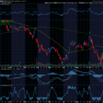
The next image is a pair of unusual candles. The first is the morning’s movement and the second is what happened in the afternoon. As you study this pair of candles over a few days you will start to notice it adds more detail and shares that often what happens in the morning isn’t the same in the afternoon.

Stockcharts.com
The candle in the left side of the circle is the morning’s candle. It tells you the day opened high as the bottom of the box and rose to close at noon close to the top. The long lower wick shows how low it dropped during that 3.5 hour period or 195 minutes. That was a pretty big drop to then recover.
The next red candle shows what happened in the afternoon. The top of the red box is where the afternoon opened which is the same place the morning candle closed. The bottom of the red candlestick is the close of the day while the wick shows how low it dropped before recovering at the end of the day.
Sizing up this information certainly suggests that the morning was the strongest period of the day. And yet, when all things were said and done, the close of the day wasn’t too much lower than the noon day high.
The next chart is an image where the whole day is broken up into 30-minute segments. Each candle shows the open, close, high and low of that 30-minute period throughout the trading day.

Stockcharts.com
This chart and its candlesticks tell even more of the story. The red candle furthest to the left says that the first 30 minutes opened up, then dropped to be negative and closed up off the low of that opening 30-miinute period. Then, it started to rise, and price increased until about 12:30 when it dropped during the lunch period until about 2:00. At this point, it started to rise again and close just a little down from the midday high.
There isn’t a right or wrong candlestick chart. It really depends on how much information you need. If your plan is to open and close a trade in the same day or over a couple days, then you will want more information. The details are important. If on the other hand, your trading goal is to hold a trade for a few weeks or a couple months, then all the intraday little swings shares too much information. What you need to see is the overall day trend, not the intraday breakdown of moves.
The takeaway is that charts and their candlesticks tell their story, and it is important for you to decide how much of the information you need? How much suits your time commitment and strategy?
Friday is education day. My goal is to teach everyday people (like me) to successfully trade options. I do my best to write in an understandable way as if we are talking while sitting on the deck of my house in a relaxed atmosphere.
The trading tools you select, and use are important, and can make your trading easier and more effective.
On a daily basis, remind yourself that your life is rich with opportunities. Every day is a new start. Decide what you want to play out and move in that direction. Take a step and then another… you will succeed! WTG!
I wish you the very best,
Wendy


Recent Comments