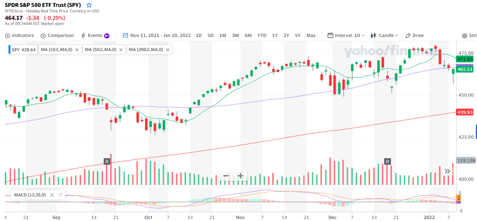
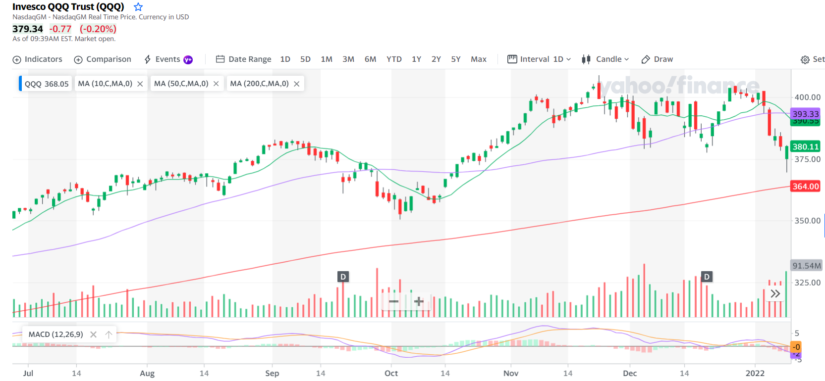
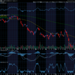
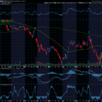
We have been watching the markets pullback and keeping an eye out for clues as to when they will find the bottom of this drop. Yesterday we saw an interesting sign that gave us a heads up as to what to expect next.
Both the SPY and QQQ showed a similar pattern that can be very useful when determining market direction.
Look at the candlestick all the way at the right on both of these charts:

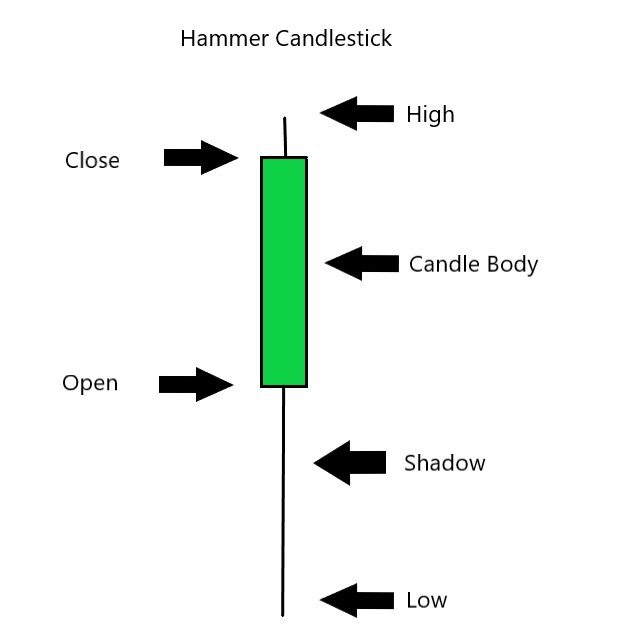
We haven’t dived into candlestick patterns but they are used on almost every chart you see. This candlestick in particular is called a hammer. Now, it is important to note that while one candle can be telling it is how that candle appears in the context of other candles that is really powerful. But when we see this hammer in a declining market it is telling us the market is trying to find a bottom.
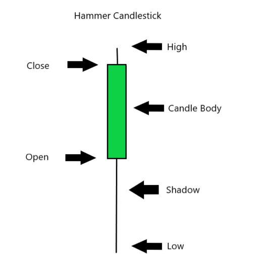
The illustration above outlines how a candle is formed. The beauty of candles and why they are used so much is that you can see a bunch of key information in one quick glance. Plus it takes numbers and turns them into a visual image that helps interpret the numbers.
What this candle is telling us is that in spite of pressure to pull the markets down (shown by the long shadow under the candle body) the markets pushed back and closed up for the day.
When you look back to the charts above and see this candle appearing when we are below the 50 day moving average, it is a sign that we might see a rebound today. It isn’t a guarantee, but it increases the likelihood.
Don Fishback has been helping traders determine the probability of a potential trade’s success. His ODDs system calculates the outcome of a trade and reveals how probable it is to be a winner. Grab his Quick Start Guide to Options Success here and see how it can help your trades.
Keep learning and trade wisely,
John Boyer
Editor
Market Wealth Daily


Recent Comments