
From Price Headley, BigTrends.com
They were all the rage just a few days back. Now they can’t do much of anything right. The so-called “Magnificent 7” names like Alphabet, Amazon, Microsoft, and Apple are now in a rather steep decline. They’re selling off at a much faster rate than the rest of the market is. In fact, we’re possibly just one bad day away from falling off the edge of cliff (so to speak) and starting a correction that will not be easy to stop.
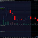
The graphic below tells the first part of the story, comparing each major sector’s performance going back to October’s low. As you can see, tech stocks — led by the Magnificent 7 — logged the biggest gains through mid-July. Since then they’ve been the market’s biggest losers.

The thing is, this weakness is steering the tech-heavy (and top-heavy) NASDAQ Composite into trouble as well.

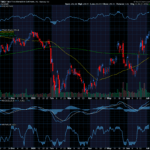
Take a look at the zoomed-in daily chart of the composite. Although the index closed a little higher on Thursday, it still logged a lower low, and is still testing the 50-day moving average line (purple) as a support level. One more daily loss could do the trick, snapping that floor and opening the door to a wave of selling. That day could be Friday, but even if it isn’t, the prospect is going to be on the table for a while.

And this bearish effort is gaining more traction than it might appear to be with just a passing glance at the chart.
It’s been a while since it’s merited discussing, but things are changing. The market’s breadth and depth is turning bearish… at least among NASDAQ-listed stocks (and the NASDAQ’s stocks tend to lead the rest of the market).
If you’re not familiar, “breadth” is a comparison of an exchange’s advancers and decliners. “Depth” is a comparison of an exchanges up volume and down volume. The daily data is unusable, as it’s too erratic to spot a trend. If you plot moving averages of this data, however, the trends become clear and comparisons can be made.

That’s what we’ve done in the middle and lower portions of the chart of the NASDAQ Composite below. The bolder red and blue lines in the middle of the chart compare the NASDAQ’s average advancers to its average number of decliners for the past 20 days. As you can see, there have been decidedly more falling stocks than rising stocks since last week.

The bigger change, however, is the recent shift of the NASDAQ’s up and down volume trends on the lowest portion of the chart. As of Thursday, there’s decidedly more down volume than up volume from NASDAQ-listed stocks. This has been a missing ingredient behind several other modest pullbacks since March.
To be clear, any one single bearish clue isn’t devastating in and of itself. In fact, we’ve yet to see the most important bearish clue take shape yet… the NASDAQ Composite’s move below its 50-day moving average line. It may not actually happen either.
Nevertheless, we’re starting to see all of these red flags at the same time. To see the composite knocking on the door of a significant technical trigger — a bearish one — is enough of a reason to prepare for the possibility of a more serious pullback.
We’re also at a time of year when stocks don’t do all that well.
Last Friday’s action could prove pivotal. Watch closely.
Price Headley
BigTrends.com


Recent Comments