*** IMPORTANT NOTE: Be sure to tune in tonight for our live, interactive webcast where we’ll reveal the #1 wealth-depleting mistake options traders make. Then we’ll show you the fastest and easiest way you can overcome that mistake to become a better option trader.
Twilio, Inc. (TWLO) appeared on our list of compressed stocks this morning. That caused us to take a deeper look into TWLO data. What we found is that with TWLO we have a potential compression plus seasonality play with a stock that has collapsed 90% from its 2021 peak to its 2022 trough.
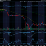
In the time series chart below the lower blue line is the two-month implied volatility. That is the expected volatility for the next earnings release. The current expectations are barely getting to 40 which is low compared to the expectations of previous earnings releases going back 5 years.


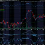
This chart using MetaStock goes back to 2017. Note that we are using a logarithmic scale in the chart. This chart shows the seasonal pattern in TWLO in the 4th quarter going into the November monthly options expiration. In each case, the stock moved bigger than current expectations at some point before the November options expiration.
Some of the big moves occur in anticipation of an earnings report, and some of the big moves occur after the earnings report. In every case, the stock made a move that is bigger than the current options prices expect. Most of those moves were wildly profitable.

This Volatility Term Structure chart for TWLO shows us the implied volatility for the at-the-money options for each expiration. This chart shows that options expiring on November 15th have the highest volatility expectations. That is because investors are anticipating the scheduled earnings report that is due before the November 15th options expiration. While these expectations are high relative to all other future expirations, they are low relative to past expectations. They are especially low relative to moves after a compression signal and seasonal moves in the fourth quarter going back to 2017.

This Volatility Cone chart for TWLO compares implied volatility expectations for each term to the historical volatility for that same term. The blue line shows the average historical volatility, the purple lines show each HV measure’s highest high and the lowest low over the past 4 years. You can see that the two-month term (which is the term we are interested in) is below the 4-year historical average. This confirms that the options for that term are relatively inexpensive.

This MDM graph compares the modeled expected distribution for future stock prices (the orange line) with the actual distribution of TWLO’s share prices over the past 4 years (the blue histogram). You can see that the actual stock movement shows that the stock tends to make bigger moves than current options prices expect.

TWLO share prices are compressed. On top of that TWLO has a strong history of making bigger moves in the 4th quarter before the November monthly option expiration. This is a very strong seasonal pattern.
While investors are already beginning to anticipate a big move around earnings, they are still underestimating the potential size of the move if TWLO continues to behave the way it has in the 4th quarter going back to 2017. That gives us an option buying opportunity.
To get the specific details and prices on today’s trade ideas, be sure to read today’s ODDS Online Daily Option Trade Idea.

To access Odds Online Daily and be able to see any stock you are tracking in this software, click here.
Thank you,
Don Fishback


Recent Comments